Ugly Food Photography, Styling Brown, Dull, or Ugly Dishes
If you are a food photographer, then no doubt you have dreaded figuring out how to make your ugly food photography look good.
I'll say this, ugly food photography takes practice!
This week, I intentionally chose to make foods that were ugly, or difficult to photograph. This way, I could show you my approach to ugly food photography. Of course, what I had intended to do, and share didn't work out. This is because ugly food can be very unpredictable.
Here are some general tips for brown, dull, or ugly food photography:
Stick to a neutral or monochromatic color palette.
Use lots of garnish.
Emphasize the texture of the food.
Choose a flattering angle.
Bring action into the scene, like a hand holding a spoon, for example.
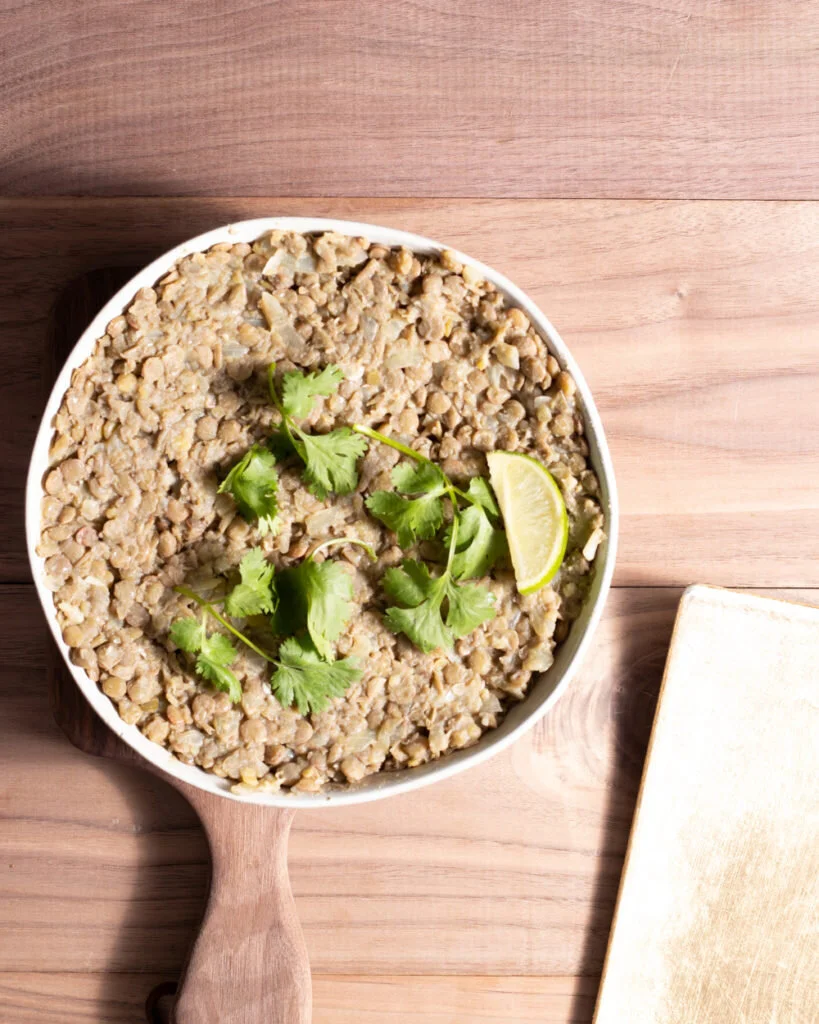
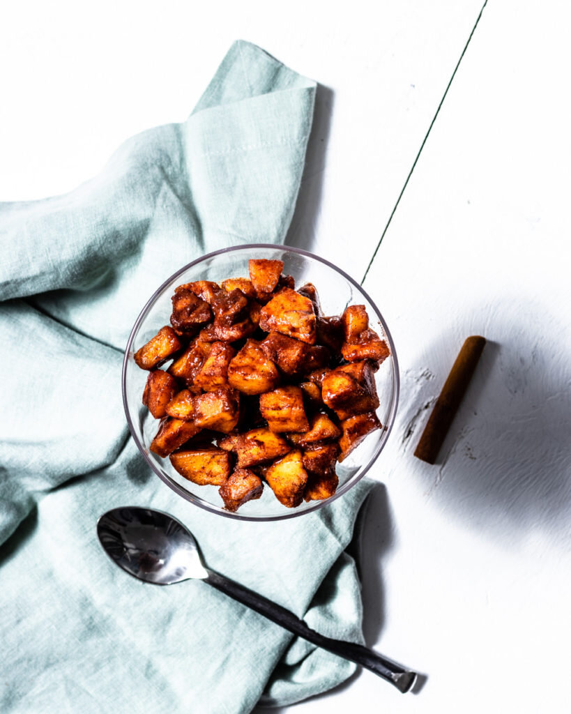
Keep in mind that the tips above are just tips. They do not always work out. For example, when I went to photograph my easy lentil mash, and my homemade apple sauce, I intended to go for a very natural look. Bringing in a neutral color palette. Almost immediately, I could see this would not work. With the lentil mash, the lentils somewhat disappeared against the wood. When I tried the same thing for the apple sauce, it just wasn't very flattering. So, how did I approach the color palette for these brown and orange colors? Well, for the apple sauce, I turned to the color wheel. Orange and blue go very well together, but you have to know what shades and hues will work together. Since the apples were so dark and orange, I chose to create contrast by keeping the rest of the scene light and airy. So, I used a white background, and a very light-colored blue. Also note that the apples have a bit of red in them too, so the hue of the blue, also has some green in it. Again, complimentary against the color wheel. I also kept the lighting full of highlights. As the food was so dark, I didn't want to bring more shadows into it. It worked! As for the lentils? I went a whole other direction. I definitely tested a few things out, like bringing in light airy colors. And, I tried playing it against some blues. In the end, I found that a combination of the colors, bringing in a very bright color palette worked best. Like I said, when it comes to ugly food photography, the basic tips just don't always work. But notice, that I still kept a lot of browns in there. Plus, the gold goes along with the brown lentils as well, because it has orange mixed in.
So, I figured out my colors for this ugly food photography.
Now, to make the food pop! If I approached the ugly food using my tips above, then I also needed to define the best angle, and really hone in on the texture. For the apple sauce, both a birds-eye view, and a 45-degree angle worked well. But, for the lentils not so much. When you looked straight down on the lentils, in the pictures above, even covered in the garnish (tip 2), they just weren't super flattering. Yes, you could see the texture, but aside from becoming almost distracted by all the color and garnish around the dish, you could also see they looked a bit dry and drab. So how could changing the angle work? Let's take a look. Normally, you wouldn't take a shot at this angle for something in a bowl. You lose the visual. However, for this it seems to work really well. Because now, I could see the texture of the lentils. And, they don't look flat. Notice too, I added the spoon, and left it right there for the viewer to feel like they could grab it and take a spoonful (tip 5).
So, that is how I approached the ugly food photography for these dishes.
It took a while, but I am fairly happy with the final result!
Did you enjoy this article on Ugly Food Photography, Styling Brown, Dull, or Ugly Dishes? Let me know what you thought by leaving me a comment below. You can also follow me on Instagram and use the hashtag #masterfoodphotography and tag @eatliftbe whenever you try one of these techniques. I love hearing about how you’re doing and seeing your creations!


